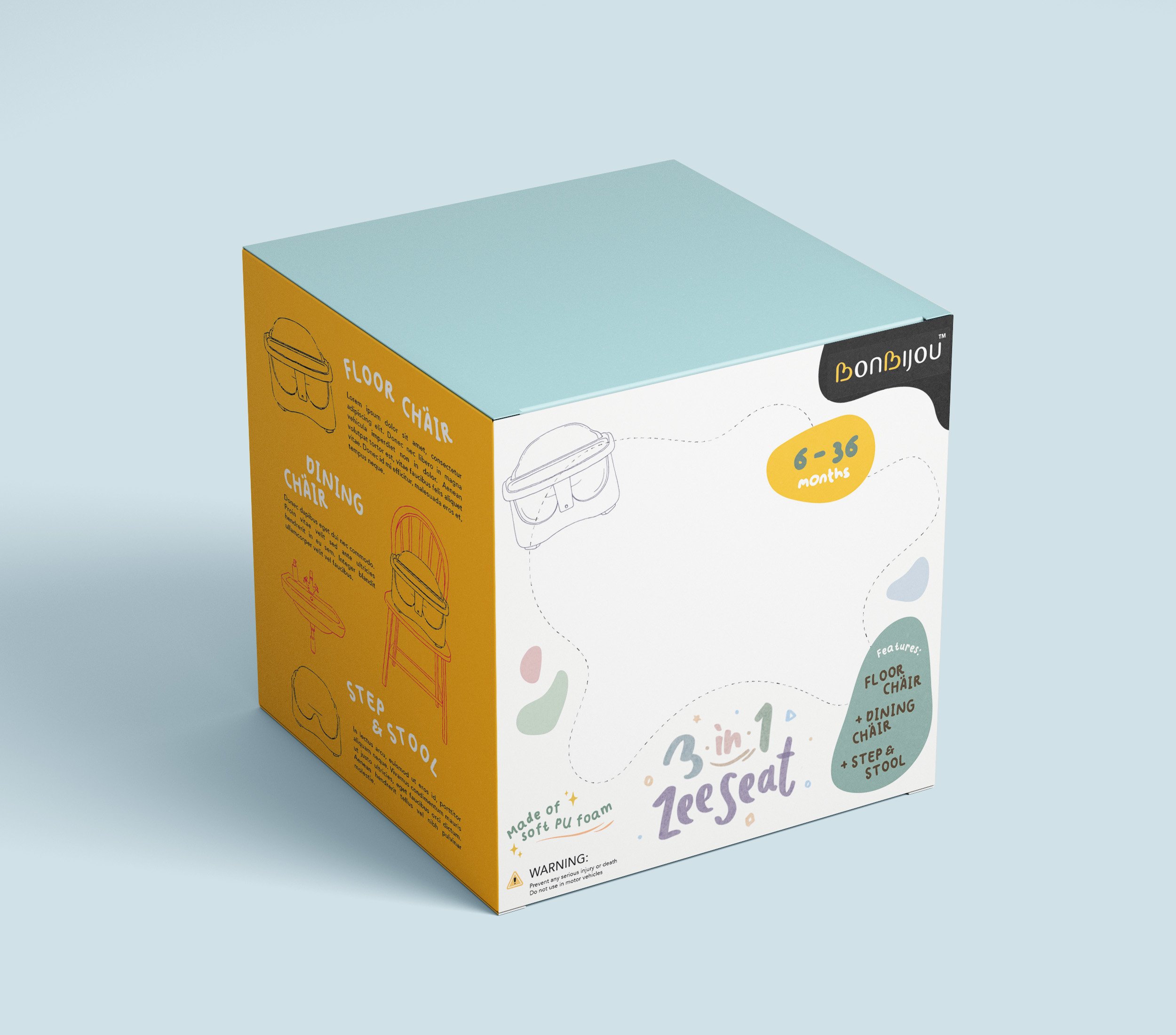
Our packaging design for the baby booster chair deviates from the conventional approach by incorporating a block color scheme. This choice allows vibrant hues to capture the audience's attention effectively


One of the primary challenges we faced was the absence of detailed product images to showcase the chair's features. To address this, we utilized hand-drawn illustrations, which not only enhance the overall visual appeal but also provide clear, informative depictions of the product’s attributes.
The logo for our baby booster chair was hand-drawn to impart a personal and playful character. The lively, bouncy quality of the lettering reflects the playful nature of a child, aligning with the fun and engaging spirit of the product.


The initial 2 design proposals featured a peekaboo window, allowing customers to view the actual color of the product and feel the material.
However, for practical storage and logistical reasons, we ultimately opted for a fully closed box design. This change ensures greater convenience and efficiency while maintaining the overall integrity and appeal of the packaging.
Initial proposal mock ups